Tour of your dashboard
Understand the metrics tiles, the conversion funnel, and the scope selector at the top.
The dashboard summarises everything happening in your organisation: how many leads you have, how they're moving through your funnel, your ICP coverage, and the health of your lead lists. It's the first screen you'll see after signing in — a single page that tells you where to focus today.
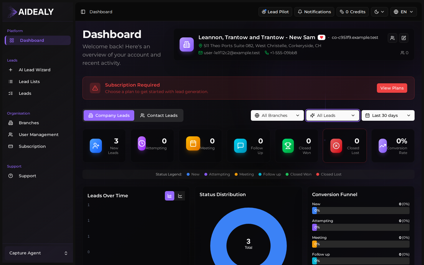
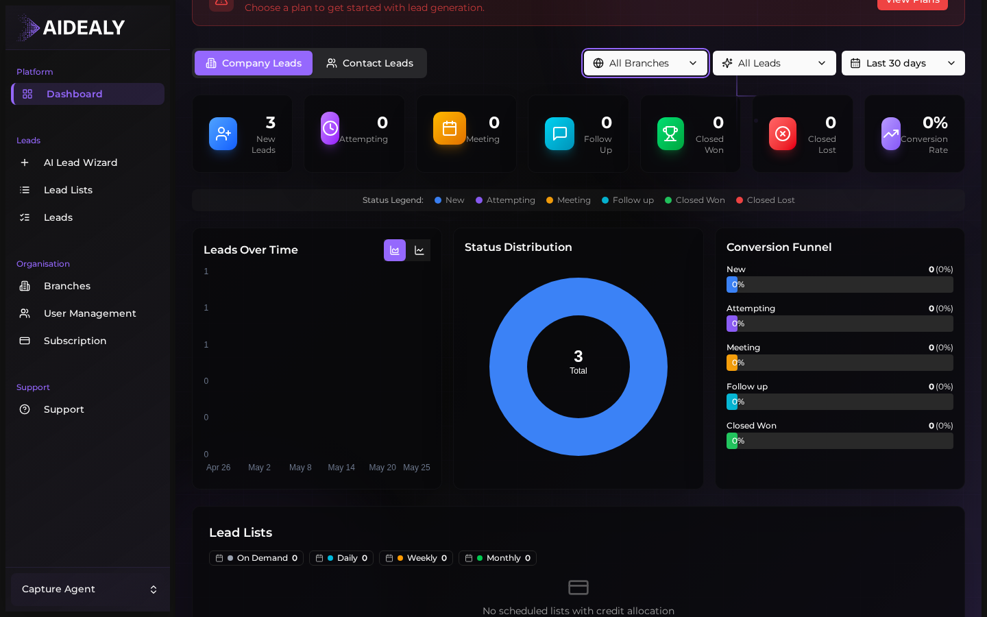
Metrics tiles
The top row of the dashboard is a strip of tiles showing your key numbers: total leads in scope, qualified leads, leads in progress, won and lost. Each tile is a snapshot — a single number you can read at a glance. Click any tile to jump straight to the Leads Hub filtered to that status.
Switch dashboard scope
- 1
Open the scope selector
At the top of the dashboard, click the scope selector. By default it shows your organisation-wide view; you can switch it to any branch you have access to.
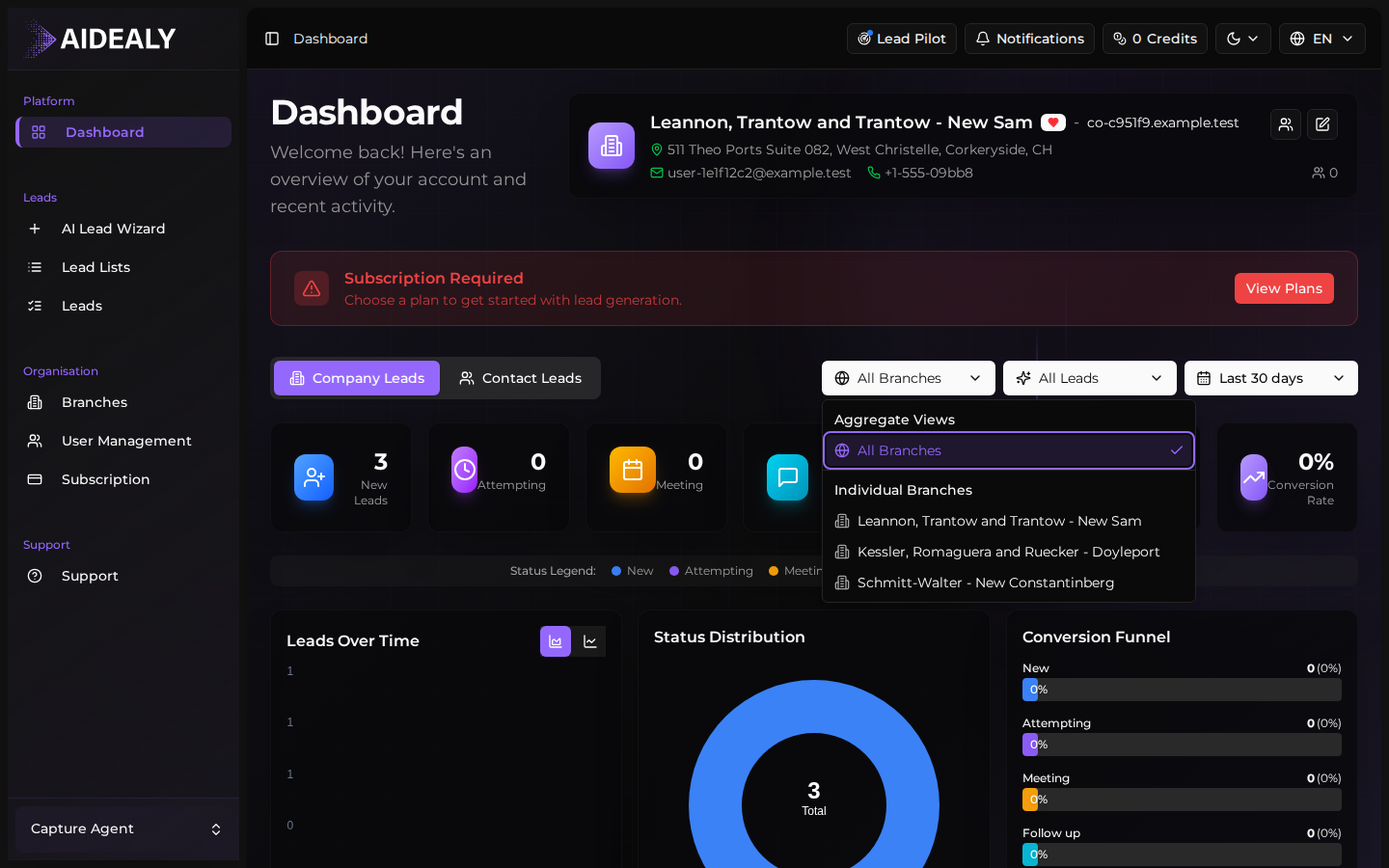
- 2
Pick a branch (or all branches)
Select a branch from the dropdown to filter every tile and chart to leads belonging to that branch. Pick All branches to go back to the organisation-wide view.
- 3
The whole dashboard updates
Metrics, funnel, and every chart re-render with the new scope. Your selection is remembered for next time you visit the dashboard, so a branch manager can land on their own view by default.
Conversion funnel
Below the tiles, the conversion funnel chart shows how leads move through your statuses over time — new at the top, won at the bottom, with everything in between. The widths tell you where leads are getting stuck. A funnel that's wide at the top and narrow halfway down is a sign that something is going wrong in qualification; a healthy funnel narrows smoothly from one stage to the next.
Use the funnel to spot blockers
If you see a big drop between two specific stages — say from Qualified to Engaged — that's where to invest your time. Open the Leads Hub, filter to that status, and look at why those leads aren't advancing. Often it's an outreach gap, not a lead-quality problem.